Shopify Checkout Conversion Rate Benchmarks 2026
Benchmark Shopify checkout completion: median 38–48%, mobile ~44%, and how agencies should prioritize fixes.

Most Shopify stores should judge checkout by checkout completion rate, not just store conversion rate. If your checkout completion rate is below 38%, that usually points to checkout friction. If mobile checkout completion is under 44%, I’d treat that as a warning sign right away.
Here’s the short version:
- Store conversion rate (CVR) and checkout completion rate (CCR) are different.
- Shopify’s broad median CVR is 1.4%, but that number mixes weak stores, strong stores, cold traffic, and repeat buyers.
- A more useful 2026 CCR range looks like this:
- Median: 38%–48%
- Top quartile: 52%–60%
- Top decile: 60%–75%
- Mobile checkout trails desktop: about 44% vs. 49%.
- Revenue band, category, country, and traffic mix all change what “good” looks like.
- For agencies, the main job is not just spotting a low number. It’s finding stores with budget, growth, and a fixable checkout problem.
If I were sizing up a merchant fast, I’d look at four things first:
- CCR vs. peer range
- Mobile vs. desktop gap
- Plan tier and revenue momentum
- Traffic mix, especially paid social vs. email
Shopify Checkout Conversion Rate Benchmarks 2026
What Is a Good Shopify Conversion Rate?
sbb-itb-61169e3
Quick comparison
| Metric | What it measures | 2026 reference point | What I’d use it for |
|---|---|---|---|
| CVR | Orders ÷ sessions | 1.4% median | Full-store view |
| CCR | Orders ÷ checkouts started | 38%–48% median | Checkout diagnosis |
| Mobile CCR | Mobile checkouts completed | 44% average | Mobile friction check |
| Desktop CCR | Desktop checkouts completed | 49% average | Device comparison |
Bottom line: I wouldn’t compare a Shopify store to the whole platform and call it a day. I’d compare it to the right peer group, then use the gap to decide whether the account is worth outreach or deeper review.
Core Shopify Checkout Conversion Benchmarks for 2026
Median, Top-Quartile, and Top-Decile Ranges Explained
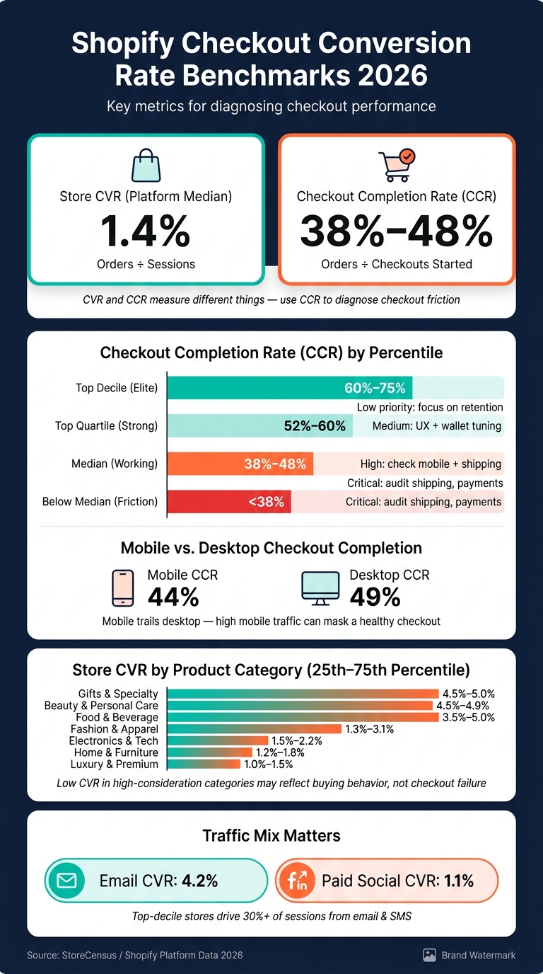
Percentile bands give you the clearest baseline for Shopify checkout performance in 2026. The often-cited 1.4% Shopify CVR is a noisy platform average, so percentile bands are a cleaner way to benchmark performance [1]. Start here, then break results out by merchant profile.
| Percentile Band | Checkout Completion Range | Interpretation | Diagnostic Priority |
|---|---|---|---|
| Top Decile | 60%–75% | Elite performance; driven by high brand trust, high-intent traffic, and low-friction UX | Low: Focus on retention and LTV |
| Top Quartile | 52%–60% | Strong performance; often tied to one-click payments and clear shipping profiles | Medium: Small UX fixes and wallet tuning |
| Median | 38%–48% | Working, but still weighed down by avoidable friction | High: Check mobile friction and shipping cost reveals |
| Below Median | <38% | Heavy friction; often linked to pricing surprises, payment errors, or a broken mobile flow | Critical: Audit shipping, taxes, and payment failures |
These ranges are the baseline. The next section shows how they move by revenue band, country, device, and category.
What Below-Median Checkout Performance Usually Signals
A checkout completion rate below 38% usually points to a small set of common issues. Shipping and tax surprises are the biggest drop-off triggers. Showing free shipping thresholds on product pages can lift conversion rates by 8%–12% [1].
There are other usual suspects too. Long mobile form fields, weak trust signals like reviews and security badges, and forced account creation can all drag down checkout completion. Payment failures and poor wallet visibility hurt as well. Stores in the bottom quartile also tend to have page load times above 2.5 seconds, which adds even more friction [1].
What Top-Quartile and Top-Decile Stores Do Differently
Top stores don't just have a smoother checkout. They also bring in a different kind of traffic. Among the top 10% of stores, email and SMS drive more than 30% of sessions [1]. Email traffic converts at 4.2% on average, which is nearly four times higher than the 1.1% that paid social usually delivers [1].
On the tech side, top-quartile and top-decile stores often use Shop Pay, Apple Pay, and Google Pay. Turning on Shop Pay cuts checkout abandonment by 5%–10% on average, and Apple Pay or Google Pay can add a 3%–5% lift for mobile users [1]. Put simply, these stores pair higher-intent traffic with faster payment options, clear free-shipping thresholds, and no forced account creation.
Those patterns shift by merchant segment, which is why the next benchmarks break performance out by revenue band, geography, device, and category.
Checkout Benchmarks by Revenue Band, Country, Device, and Product Category
Once you know the baseline, the next step is segmentation. Don’t judge checkout performance against the full Shopify platform. That’s too broad to be useful. A store doing under $50,000 a year is playing a very different game from a store doing $1,000,000+.
Revenue Band and Country Splits
Shopify stores should be benchmarked against similar merchants, not the full platform. Revenue band shifts what “good” checkout performance looks like, so the fairest comparison is against stores at a similar stage.
Revenue Band Context
| Revenue Tier | Annual Sales Range | Store Share | Checkout Context |
|---|---|---|---|
| Emerging | Under $50k | 63% | Early stage; checkout basics often incomplete [2] |
| Growth | $50k–$250k | 21% | Mid-market; checkout friction is the main conversion lever [2] |
| Established | $250k–$1M | 11% | Scaling; wallet coverage and shipping clarity drive CCR gains [2] |
| Enterprise / Plus | $1M+ | 5% | High volume; checkout is optimized; focus on marginal CCR improvements [2] |
That framing matters. If an Emerging store has checkout issues, the problem may be missing basics. If an Enterprise / Plus store is lagging, the issue is more likely small points of friction that chip away at conversion.
Geography comes after revenue band. It can help, but only if the sample size is big enough to make the comparison useful. Country-level checkout data is still too thin to support firm 2026 cutoffs, so use geography as a directional filter, not a hard scoring rule [2].
Mobile, Desktop, and Tablet: How Device Affects Checkout Completion
After revenue band, device mix is usually the next thing to check. A store can look weak on checkout completion when the real story is simple: it gets a lot of mobile traffic.
| Metric Type | Device | Benchmark (Avg) |
|---|---|---|
| Checkout Completion (CCR) | Mobile | 44% [1] |
| Checkout Completion (CCR) | Desktop | 49% [1] |
Mobile checkout still trails desktop, and the main reason is plain enough: typing on a phone is a pain. Address entry creates friction, and that drag shows up in completion rates [1].
So if one merchant gets most of its traffic from mobile and another leans desktop, a straight comparison can mislead you fast. The checkout might not be weak at all. The traffic mix may be doing most of the talking.
Product Category Variation and Why Peer Group Comparisons Matter
Category is the last filter. This is where raw benchmark comparisons can start to break down, because buying intent and purchase complexity vary a lot from one type of product to another.
The table below reports store conversion rate by category. It’s a proxy for checkout context, not a checkout-only benchmark.
| Category | CVR Range (25th–75th Percentile) | Abandonment Rate | Qualification Notes |
|---|---|---|---|
| Gifts & Specialty | 4.5%–5.0% [1] | 62%–68% [1] | Highest intent; seasonal spikes |
| Beauty & Personal Care | 4.5%–4.9% [1] | 60%–67% [1] | High repeat purchase and UGC |
| Food & Beverage | 3.5%–5.0% [1] | - | Habitual buying; subscription-heavy |
| Fashion & Apparel | 1.3%–3.1% [1] | - | High return rates; sizing uncertainty |
| Electronics & Tech | 1.5%–2.2% [1] | 74%–80% [1] | Long research cycles; price sensitive |
| Home & Furniture | 1.2%–1.8% [1] | 76%–82% [1] | High consideration; long purchase cycle |
| Luxury & Premium | 1.0%–1.5% [1] | 78%–85% [1] | Prestige buying; trust-dependent |
A low CVR in Luxury & Premium or Home & Furniture doesn’t automatically mean the checkout is underperforming. Those purchases often take more time. Shoppers compare options, think about price, and come back later. In other words, the lower conversion can reflect buying behavior, not a checkout problem.
That’s why peer-group comparison matters so much. If you flag every low-converting category the same way, you’ll end up diagnosing the wrong issue. Traffic mix and purchase intent can explain a big part of the gap [1].
How Agency Teams Should Score Merchant Fit Using Checkout Data
A low checkout completion rate matters only when it points to a merchant that can pay, is growing, and has a fixable problem. That’s why checkout benchmarks should help you rank merchants, not just report on performance.
A Merchant-Fit Scorecard Built Around Checkout Data
The point of a scorecard is simple: stop relying on gut feel and make qualification decisions the same way every time. The criteria below weigh checkout performance - median, top-quartile, and top-decile gaps - against the signals that show whether a merchant can actually buy and use optimization work well.
| Criterion | Evidence Source | Weighting | Outreach Priority |
|---|---|---|---|
| Budget Capacity | Shopify Plan (Plus/Advanced) | 35% | Essential for budget qualification |
| Momentum | Activity: Revenue Increased (30d) | 25% | Signals scaling and need for efficiency |
| CVR Gap | Niche Benchmark vs. Estimated CVR | 15% | Defines the problem to be solved |
| Mobile Gap | Mobile vs. Desktop CVR Delta | 10% | Clear technical wedge for CRO |
| Tech Stack Gap | Missing Email/Reviews/Analytics | 10% | Specific fit indicator |
| Traffic Mix | Paid Social vs. Email/Organic | 5% | Contextualizes the CVR performance |
Revenue and momentum qualify the account. CVR and mobile gaps shape the pitch. If you spot a mobile gap inside a high-budget account, that’s not random noise - it’s a strong sales signal.
High-Priority Fit, Diagnostic Fit, and Low-Priority Fit: How to Sort Your Pipeline
Once you can see the gap, sort accounts by budget and urgency.
| Fit Tier | Defining Traits | Likely Sales Angle | Qualification Risk |
|---|---|---|---|
| High-Priority | Plus/Advanced plan + revenue growth signal + clear tech gaps | Scale your momentum by fixing the leaky bucket | High competition from other agencies |
| Diagnostic | Mid-tier revenue + low CVR + high ad spend, no growth signal | Your ad ROI is being throttled by checkout friction | May have internal dev bottlenecks or limited budget |
| Low-Priority | Basic plan + under 10,000 monthly traffic + zero apps | Low-touch education | Low budget; high price sensitivity |
High-priority accounts bring together three things: a clear CVR gap, budget capacity, and active momentum. Diagnostic accounts do show a problem, but they need a second look. Sometimes the issue is traffic quality, not checkout friction. Stores with zero apps and under 10,000 monthly visits are usually poor-fit prospects for full optimization [3].
Using StoreCensus to Build and Prioritize Your Merchant Shortlist
StoreCensus lets you filter across 6M+ stores by plan tier, tech stack gaps, and growth signals, so you can run this scorecard at scale instead of doing it by hand [3]. Activity triggers like Revenue Increased or Competitor App Uninstalled can help you time outreach better, and decision-maker contacts help you reach founders and ecommerce leads directly [2].
That gives you a shortlist based on both performance and fit.
Conclusion: What to Benchmark, What to Ignore, and What to Do Next
Track checkout completion on its own instead of lumping it in with store-wide CVR. A 1.4% store CVR, by itself, doesn’t prove the checkout is broken. But if mobile checkout completion is below 44% and most traffic comes from paid social, that points to checkout friction, not weak acquisition quality [1]. At that point, the next move is merchant-fit scoring, not more surface-level reporting.
Use the median as your baseline, not the average. Then look at the upper bands for context. The top 20% of Shopify stores convert at 3.2% or higher, and the top 10% clear 4.7% [1].
Compare each merchant to its category range, not the platform median. That delta is what agency teams should use to sort and rank accounts.
Here’s how those gaps turn into outreach signals:
| Signal | Benchmark to Use | Agency Action It Should Trigger |
|---|---|---|
| Checkout completion under 44% on mobile | Mobile average: 44% [1] | UX friction review |
| CVR below niche midpoint | Niche-specific range | Performance gap pitch |
| Shopify Plus plan + recent revenue growth signal | Budget + momentum signal | High-priority outreach |
| Paid social-heavy traffic with weak checkout completion | Paid social CVR: 1.1% vs. email CVR: 4.2% [1] | Retention/email pitch |
The gap between a merchant and its peer group is the outreach trigger. But the gap alone isn’t enough. Commercial value still decides if an account is worth the effort: plan tier, momentum, and traffic mix all count. Use StoreCensus to filter by plan, tech stack gaps, and growth signals using Shopify store guides, then move the accounts with both upside and buying power to the top of the list.
FAQs
What’s the difference between CVR and CCR?
CVR shows the percentage of all store visitors who end up making a purchase. In plain English, it tells you how the site is doing as a whole.
CCR shows the percentage of people who make it to checkout and then finish their purchase. It zooms in on the checkout itself, which makes it handy for finding friction in that last step, like payment errors or problems in the checkout flow.
How do I know if my mobile checkout is underperforming?
Segment Shopify Analytics by device. If your mobile conversion rate is below 1.0% or far behind desktop, which often averages 1.9%, your mobile checkout is likely lagging.
Also look for a sharp drop-off between add-to-cart and checkout. Mobile abandonment of 73–78% usually points to friction, like surprise shipping costs, long forms, or slow load times.
Should I benchmark my store against Shopify overall or my peer group?
Benchmark against your peer group, not Shopify as a whole.
The platform-wide average gets pulled down by inactive stores and shops that haven’t been tuned up. So if you use that as your yardstick, you can end up comparing your store to the wrong crowd and making bad calls.
A better move is to compare your store with active, managed stores that match your niche, price point, and traffic tier. Tools like StoreCensus can help you set more realistic, data-backed goals based on stores that look a lot more like yours.