Why Visualizing Tech Stacks Improves Lead Targeting
Visualizing ecommerce tech stacks speeds analysis, exposes tool gaps and real-time buying signals, and improves lead qualification and response rates.


Visualizing tech stacks transforms raw data into actionable insights for sales teams. By using tools like network diagrams, heat maps, and timelines, you can quickly identify patterns, gaps, and high-intent signals in ecommerce businesses. This approach not only reduces analysis time by 75% but also improves lead qualification accuracy and boosts response rates by 60%.
Key takeaways:
- Tech stack visualization highlights opportunities like missing tools or recent app changes.
- Real-time updates help sales teams engage prospects when they’re most likely to convert.
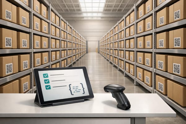
- Tools like StoreCensus simplify lead targeting by tracking over 2.5 million ecommerce stores and enriching data with 25+ metrics.
Switching from spreadsheets to visual tools makes decision-making faster and more effective, helping teams close more deals with less effort.
How Visualizing Tech Stacks Improves Cognitive Performance
When sales teams rely on spreadsheets to analyze raw data, they often face "priority paralysis." This happens when every lead looks the same, making it nearly impossible to decide which prospects deserve attention first. The result? Slower decisions and wasted effort on leads that don't bring much value. By visualizing tech stack data, raw numbers are transformed into clear, actionable patterns that the brain can process almost instantly. This shift boosts pattern recognition and speeds up decision-making.
Spreadsheet-based systems lose about 70% of qualified leads, mostly due to poor follow-up and the loss of context during data transfers. Centralizing and visualizing tech stack data ensures that critical insights stick with each prospect throughout the sales cycle, preventing these costly losses.
Better Pattern Recognition in Complex Data
Visual tools make it easier to spot technology gaps and integration opportunities. For instance, filtering to find businesses that use Shopify Plus and ReCharge but don’t use Klaviyo can immediately highlight prospects who might need email marketing automation. Between 2024 and 2025, Sarah, who runs an email agency for subscription brands, used this exact approach to target Shopify beauty brands earning $1M–$5M annually. By focusing on these tech gaps, she converted 25% of her qualified leads and scaled her agency to $84,000 in monthly recurring revenue (MRR) with 14 clients by the end of her first year.
Timelines also help identify whether a company operates with modern, integrated tools or outdated, disconnected systems. This kind of pattern recognition gives sales teams insight into a prospect's operational maturity and their likelihood of investing in new solutions - details that spreadsheets alone can’t reveal.
While recognizing patterns helps streamline analysis, having clear decision-making frameworks takes performance even further.
Faster Decision-Making
Using a 1–5 star rating system allows sales teams to prioritize efficiently. With this system, they can zero in on 5-star prospects - those with the right budget, need, and timing - while deprioritizing weaker leads. Teams that focus 60% of their efforts on these top-tier prospects see close rates between 40% and 60%, compared to less than 3% for poorly qualified leads. This approach eliminates the guesswork of spreadsheet analysis, replacing it with clear, data-driven decisions that save time and energy.
Common Visualization Methods for Ecommerce Tech Stacks
Once sales teams understand the cognitive advantages of visualization, the next step is selecting methods that turn raw tech stack data into actionable insights. Three effective approaches are network diagrams, heat maps, and change timelines. Here’s how each method works and the insights they can reveal.
Network Diagrams for Tool Compatibility
Network diagrams map out how different tools connect and interact. They show relationships, like Klaviyo integrating with Recharge, to uncover complementary tools and highlight missing integrations. For example, if a Shopify store uses Recharge for subscriptions but lacks an email marketing platform, a network diagram makes this gap obvious. This gives sales teams a clear opportunity to propose tailored solutions that fit the store’s specific tech stack needs.
Heat Maps for Technology Gaps
Heat maps use color-coded visuals to make technology gaps across prospects easy to spot. By highlighting areas where key tools are missing, teams can quickly prioritize outreach. This method ensures efforts are focused on prospects with the highest potential for conversion, saving time and boosting efficiency.
Change Timelines for Real-Time Insights
Change timelines provide real-time tracking of app installations, removals, and design updates. This allows sales teams to act immediately on high-intent signals. Companies using this method have reported revenue growth ranging from 233% to 300% with the same level of prospecting effort compared to traditional approaches.
For instance, if a timeline shows a competitor’s app was uninstalled in the last 24–48 hours, sales teams can reach out with a targeted message like, "Noticed you moved away from [Competitor]. Are you looking for a solution with [Specific Benefit]?" This kind of timely outreach ensures teams engage prospects at the moment they’re most receptive.
| Trigger Scenario | Timeline | Outreach Approach |
|---|---|---|
| App Install Gap | Immediately upon detection | "Noticed you're using [App A] but not [App B]. Most brands see [X%] gain by connecting them." |
| Competitor Uninstall | Within 24–48 hours | "Noticed you moved away from [Competitor]. Are you looking for a more [Specific Benefit] solution?" |
| Contract Lock-In | 2 weeks before end | "Your contract ends soon. Ready to explore alternatives?" |
| Budget Timing | 1st week of new quarter | "Budget should be refreshed now. Still interested in [Solution]?" |
These visualization methods not only simplify complex data but also help sales teams act strategically, improving their ability to close deals effectively and efficiently.
Research Findings: Tech Stack Visualization and Lead Targeting Results
Raw Data vs Visualized Data: Lead Targeting Performance Comparison
Data from B2B Sales Research
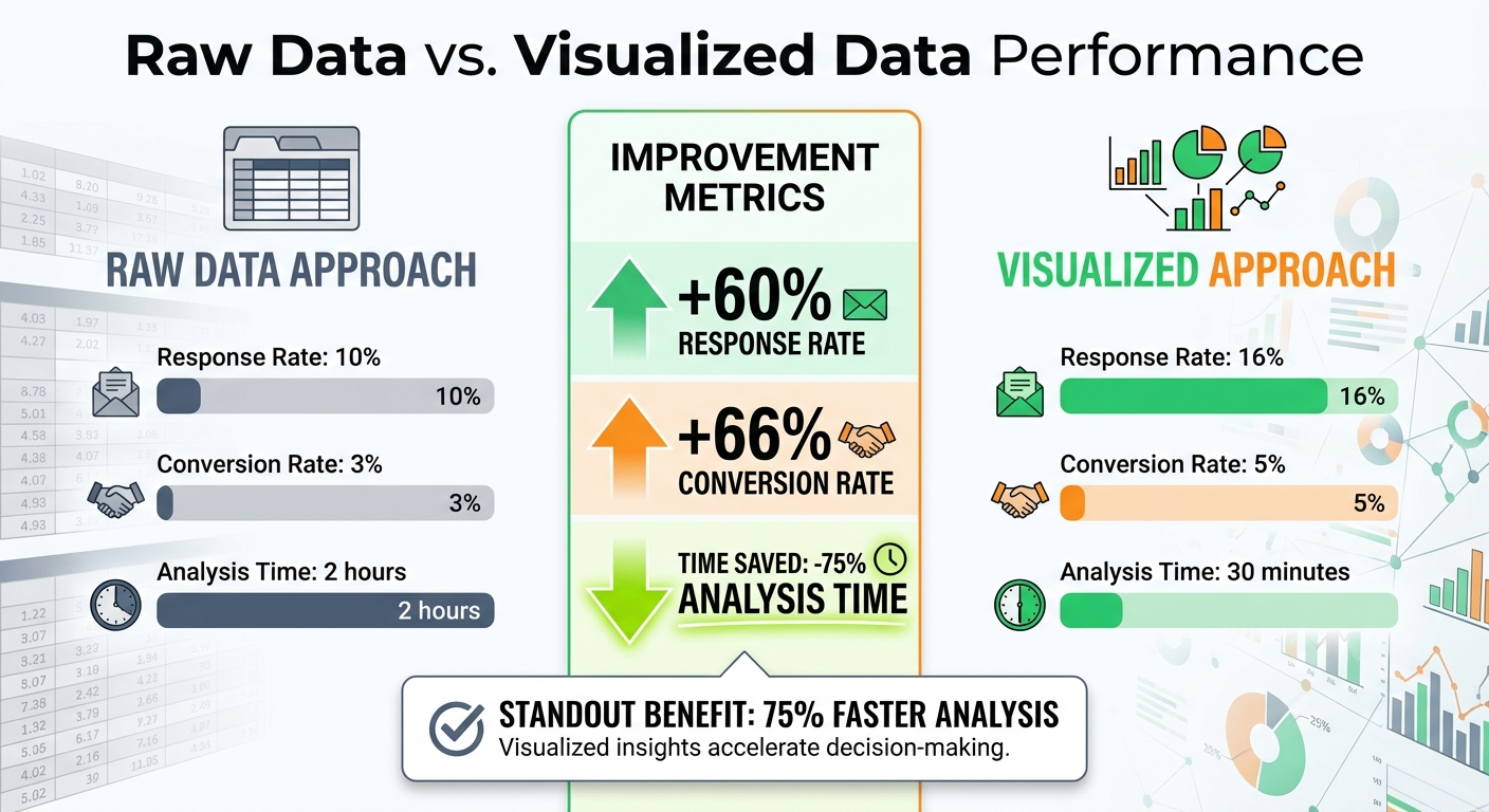
Recent research highlights how visualization tools can transform lead targeting for sales teams. By using visualized data instead of raw datasets, sales teams achieve better results across several key metrics. Studies on cognitive load reduction reveal that visual representations of tech stacks cut analysis time by 75% and improve lead qualification accuracy. For example, B2B teams targeting ecommerce businesses with visualized data report 16% response rates compared to 10% with raw data, marking a 60% increase in engagement.
The revenue impact is just as striking. Agencies adopting a visualized pipeline framework generate 233% more revenue from the same prospecting efforts compared to traditional methods. Automation tools that rely on visual tech stack cues also show similar benefits. Teams tracking real-time app installations or removals through visual timelines report 50-70% higher engagement rates when reaching out immediately after detecting events like competitor app uninstalls or new tool additions. These findings emphasize how visualization can turn raw data into actionable insights, making lead targeting more precise and effective.
Raw Data vs. Visualized Data: A Comparison
The table below illustrates the performance difference between raw data and visualized data approaches, clearly showing the advantages of visualization in sales metrics:
| Metric | Raw Data Approach | Visualized Approach | Improvement (%) |
|---|---|---|---|
| Response Rate | 10% | 16% | +60% |
| Conversion Rate | 3% | 5% | +66% |
| Analysis Time | 2 hours | 30 minutes | -75% |
These improvements stem from better pattern recognition and quicker decision-making. For example, when sales teams identify technology gaps - such as a store using ReCharge but lacking email marketing tools - they can tailor their pitches to address those specific needs. This targeted approach not only boosts conversion rates by 66% but also slashes the time required for prospect analysis by 75%.
How StoreCensus Enables Visualization-Driven Lead Targeting
Tech Stack Data Enrichment
StoreCensus takes data from over 2.5 million ecommerce stores and enriches it with more than 25 structured data points. These include details like installed apps, themes, technologies, revenue estimates, traffic, product catalog size, team size, location, and activity signals. This structured approach transforms raw data into clear visual patterns, making it easier to analyze.
For instance, agencies can filter specific tech stack details, such as stores with Klaviyo integrations or recent theme changes, to create network diagrams. These diagrams reveal tool compatibility and highlight any gaps. The enriched data also integrates seamlessly with real-time monitoring, ensuring continuous insights into store activity.
Real-Time Change Monitoring and Alerts
StoreCensus performs daily crawls to track changes like app installs, removals, theme updates, revenue fluctuations, and new social signals. For example, if a store adds a Klaviyo integration on November 15, 2025, or switches to the Dawn theme, StoreCensus logs these changes and provides historical snapshots for trend analysis.
These real-time alerts give sales teams the ability to act when prospects show strong buying signals. By turning tech stack updates into actionable insights, teams can engage with potential clients at the right moment. Combined with advanced filtering, these alerts help refine lead segmentation for more targeted outreach.
Customizable Filtering and Segmentation Tools
With enriched data and real-time updates, StoreCensus offers advanced filtering tools that simplify raw information into actionable visual hierarchies. These tools allow users to apply Boolean filters to pinpoint stores with specific setups - like those using ReCharge but lacking Klaviyo - and export the data as CSV files for use in custom dashboards or visualization platforms.
A built-in 1-5 star rating system further refines lead prioritization by evaluating factors like budget, need, and timing. Five-star leads - those meeting all criteria - show expected close rates of 40–60%. Four-star leads, which meet three out of four criteria, deliver close rates of 20–30%. This segmentation helps sales teams focus on the most promising opportunities, turning tech stack insights into actionable strategies.
Conclusion
Visualizing tech stacks changes the game for agencies, SaaS founders, and growth teams aiming to improve ecommerce lead targeting. Instead of losing up to 70% of qualified leads in the chaos of spreadsheets, visualization brings clarity by highlighting key patterns that drive action. It allows teams to spot complementary tools, identify tech gaps, and track active changes - eliminating guesswork entirely.
Take, for instance, an agency that used targeted visualization to convert 25% of its qualified leads. This approach helped them quickly scale their monthly recurring revenue. These results highlight how combining visualization with advanced filtering and real-time updates sharpens lead targeting. By simplifying decision-making through clear, visual patterns, teams unlock revenue growth that older, less efficient methods simply can't deliver.
FAQs
What buying signals can tech stack changes reveal?
Tech stack updates often serve as clear indicators of a company's direction - whether it's growth, new revenue opportunities, or strategic realignments. For instance, when a business installs or removes certain apps, it can highlight their interest in particular tools or platforms. These actions might signal a strong intent or readiness to make a purchase.
Which visualization works best for my outreach?
The most effective outreach strategies use data signals such as app installs, growth trends, and changes in tech stacks. These signals allow for timely and personalized outreach, especially when prospects display high intent or recent activity. By targeting these key moments, you can increase response rates and maximize pipeline ROI, ensuring your efforts are focused where they matter most.
How do I turn stack insights into a lead score?
To develop a lead score using stack insights, leverage real-time data signals like app installations, revenue trends, and updates to a company's tech stack to assess both buyer intent and compatibility. Tools like StoreCensus can simplify this process by automatically scoring stores based on activity indicators, such as recent app usage or hitting growth milestones. This approach allows you to focus on high-value prospects and tailor your outreach to their current level of engagement and growth trajectory.